

Welcome to The Friday Face-Off, a weekly meme at Books by Proxy. Join us every Friday as we pit cover against cover, and publisher against publisher, to find the best artwork in our literary universe. You can find a list of upcoming topics at Lynn's Books.
This week's topic is:
Current Read
For this week's current read, I'm featuring some editions of a book I just finished reading earlier in the week, Master of Sorrows by Justin Call. This was actually a re-read because I wanted to finally get around to finishing the sequel in preparation for the third book, and my memory needed a big refresher before doing so. I'm pleased to say that I think I enjoyed Master of Sorrows even more the second time around, and I'm loving Master Artificer (book #2) now! With all that being said, let's check out some of the gorgeous covers that exist for Master of Sorrows.
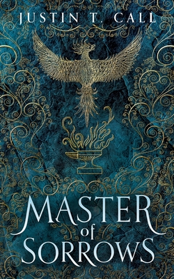
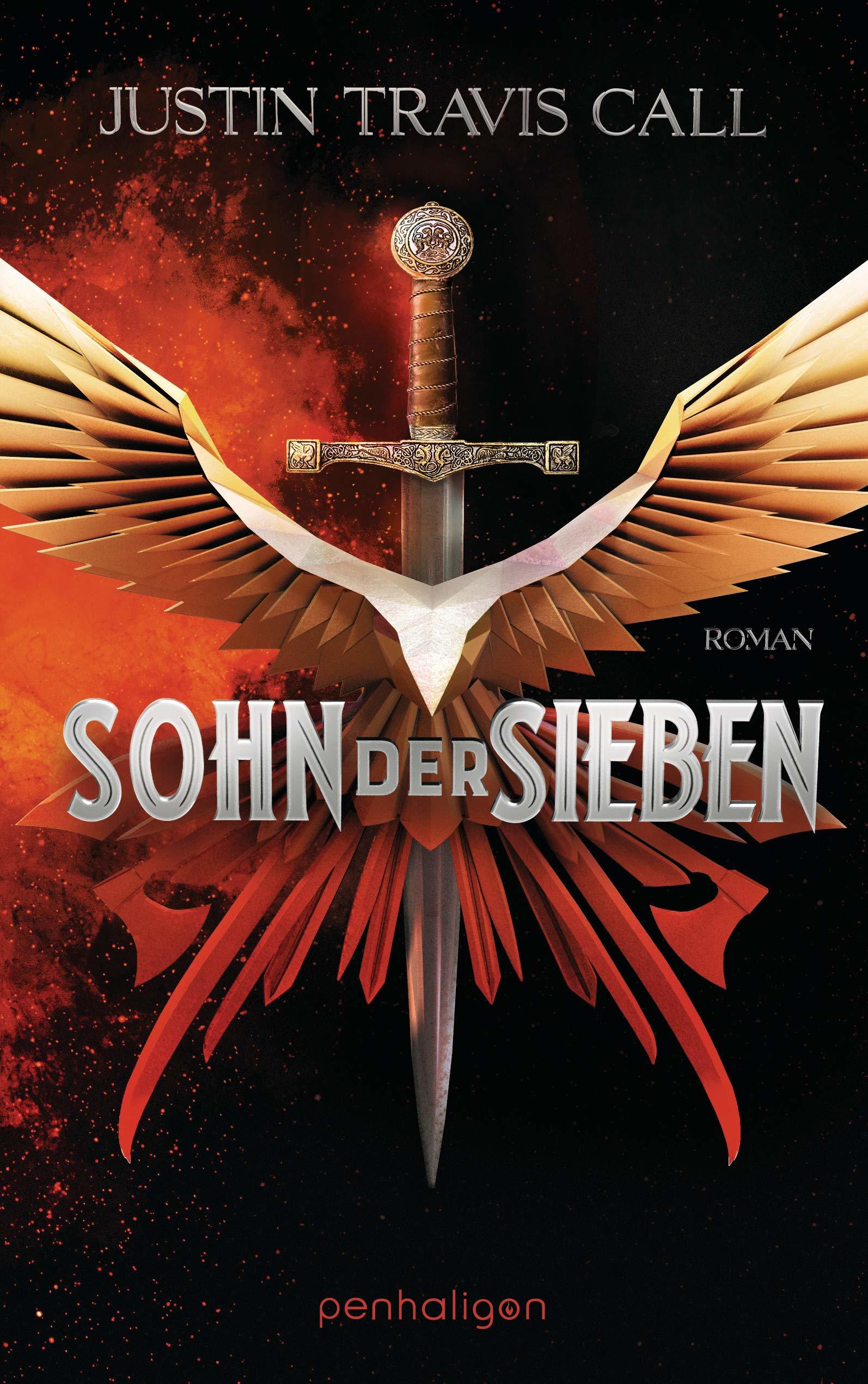
2019 US Hardcover | 2019 German
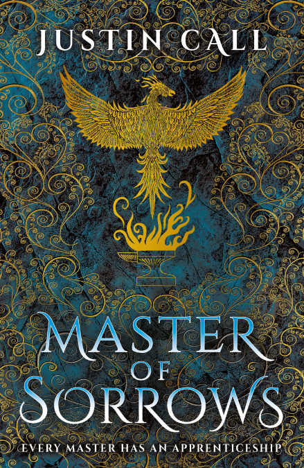
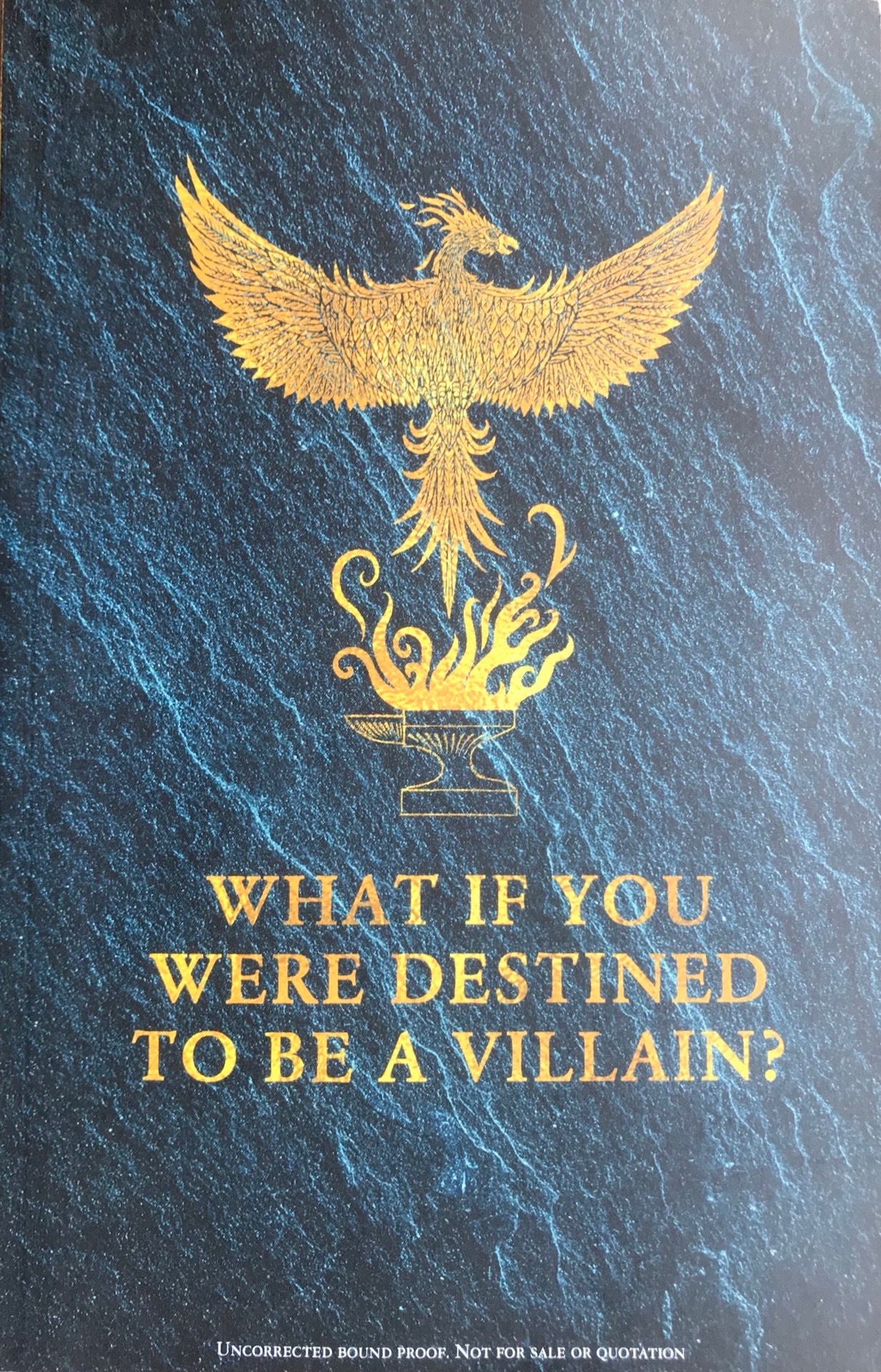
2019 UK Hardcover | 2019 ARC
My choice(s):
There are some great editions out there, but I think it's probably understable when I say that the original US hardcover is easily my favorite. It's absolutely stunning, and it's even more gorgeous in person (and very heavy!). The UK edition is obviously basically the same thing, but with a brighter gold which I do think pops quite nicely. I also had to include the ARC version because I love its design and tagline. Which edition do you like the most?
I like the UK hardcover best! Like you said, the brighter gold really pops and it's easier to see the beautiful design. Also, is the German title different? "Sohn der Sieben" translates to "Son of Seven".
ReplyDeleteThis is a tough call but I may like the UK hardcover the best (that gold and I like th slightly more blue lettering) but they;re both fabulous.
ReplyDeleteI really like the pops of gold on the UK version!
ReplyDelete