

Welcome to The Friday Face-Off, a weekly meme here at Books by Proxy. Join us every Friday as we pit cover against cover, and publisher against publisher, to find the best artwork in our literary universe.
I'm always on the lookout for exciting new blog features to try out, so this week I have decided to join The Friday Face-Off!
A quick note regarding this week's topic: I, being a highly intelligent person (note: sarcasm), misread the dates and created this post thinking it was for August 18th when in reality it was the one for last week, August 11th. Oops. I've decided to leave it, however, because it took a lot of time and because I haven't really read any books with food on the cover (this week's topic). So I'll be back on track next time I join in!
This week's topic:
"No soldier outlives a thousand chances"
A cover which features a soldier
For this one, I chose:
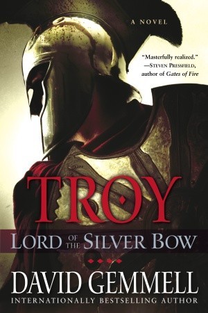
Lord of the Silver Bow (Troy #1) by David Gemmell
Ballantine Books (Paperback)
Bantam Press

I really like the simplicity of this style and I think it gives the entire book a very sophisticated feel. I definitely get 'Ancient Greek' vibes from it. The only downside is that it really doesn't give many clues about the book itself, and I wouldn't really know what I was getting into based on the image alone. I love the typography and style of 'Troy' on it as well.
Ballantine Books (Ebook)

I think this is an interesting style, particularly because it almost seems as if it's the same cover as the original, but just a different angle. I'm not sure if I like the head-on view, however, and the eye sort of bothers me. I'm also not a fan of how the titles and author are written.
Corgi (Mass Market)

Does this one remind anyone else of a video game? Something about it seems very video game-style to me, though I'm not sur what. It's almost too clean, if that makes sense. I like the color scheme and its similarities to the first cover. The only issue I have is with the placement of the author's name. It's in an obvious place, but it doesn't really seem that noticeable and I feel as though it should be elsewhere.
Piemme Pocket (Italian)

I really wanted to include this one because of how different it is from the others. The monochromatic theme of this cover gives it a rather austere and very serious look. Overall I do like this one, but I can see how it might come across as a bit plain. The space between the title (and the really really small writing) and the top of the helmet could be minimized a bit.
Vydavatel'stvo Slovart (Slovak)

I really like this one! I love that it incorporate the sea aspect of this book the various symbols on the ship and sail. I think this definitely makes for an intriguing and gripping cover, plus it's a huge diversion from every other cover
Which cover do you like best?
No comments:
Post a Comment